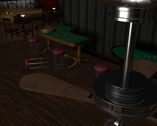
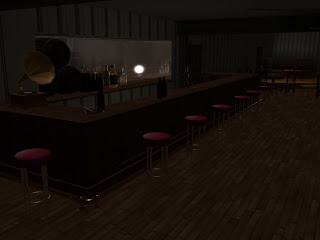
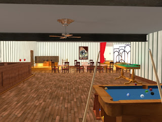
The Digital environments project has by far been my favourite project since I started at Ravensbourne. It has given me the opportunity to make something I'm genuinely proud of, whilst enjoying the process of making it.
Modeling, Texturing and Cinematography have always been the things I enjoy the most and this project was perfect for me to show these skills off. The group I was in also helped, everyone pulled their weight and were helpful in any way they could be. From the start plenty of work was being done. However, I ended up taking the reigns and organising people as we had let the communication and organisation slip over the Christmas break. However once everyone was back on track it was fairly easy to get the last pieces of the puzzle complete.
I'm very happy with the way our film has come out and hope anyone else who sees it will enjoy it too.
The atmosphere we were going for has been hit as far as I'm concerned and definitely feels like something film noir-esque. The models have enough detail to make the piece realistic too.
In a way it's a shame the project had to end when it did. There was plenty more we could have done with the film, had we been able to make it longer and have more time to make it. It would have been nice to include more character animation but there simply was not the time to make it to the standard we would have needed. This however may be something we look into in the future.
I just hope my next project is as enjoyable.
Environment Design
Thursday, 13 January 2011
Wednesday, 12 January 2011
Composition
In order to get the renders done in time to meet the dead line we had to assign each member of the group at least two cameras to render. This way, although the render times were very slow it was a lot more manageable.
Once the camera shots were all rendered I started to bring the scenes together using adobe premiere.
Ive used the software a few times before so putting the file together wasn't too tricky.
The audio is comprised to two songs cut to fit as well as sounds effects. the audio was mixed by alex.
I then imported the audio and used it as reference for placing the video. I tried to make the scenes flow with the music.
Overall the timings seem to work, and help bring the scene together. Helping to create the dark atmosphere that we were going for.
backroom
As well as the main bar area, the scene includes a back room. This is like the office of the bar owner.
After collecting models from the other members of the group and selecting my own I scaled and placed everything within the new room.
Here are some rendered shots from the back room.
The Zippo was modeled by me, ashtray by alex.
The two models went nicely together for this shot.
I wasn't able to incorporate it into a camera angle as it wasn't economical regarding time to concentrate on every model in such detail.
This is the backroom. This is how it looked after i arranged all the models. i tried to make it look as natural as possible. Like it had just been used.
I was happy with the way this came out, as i think it shows a nice selection of models as well as the room itself.
The room itself was made by using planes. I actually left one of the sides off so that we could get the camera angles we needed, with out being obstructed. At no point do you see the wall but for no reason would an audience suspect its not there, so it works
Cinematography
After testing, I came up with the final camera shots for the bar.
here are examples of cameras which will be used in the final piece.
 I chose these angles because I felt they showed off the different areas of the bar well whilst also incorporating interesting and different shots.
I used the storyboards josh had done as reference but ended up changing most of them slightly or incorporating movement into the shots more.
The one seen on the left was one of my favourite angles. Having a shot from up by a ceiling fan was something which I had come up with when the idea for the bar was first conceived.
Cinematography is one of my favourite things to do. I like how with the right cameras you can add atmosphere to the piece. The speed in which the cameras move was important for two reasons.
Firstly I wanted to make the piece feel atmospheric and give it slow and fairly dramatic feel but secondly we had to be able to show the models, texturing and lighting well as that was the nature of the project in the first place.
here are examples of cameras which will be used in the final piece.
 I chose these angles because I felt they showed off the different areas of the bar well whilst also incorporating interesting and different shots.
I used the storyboards josh had done as reference but ended up changing most of them slightly or incorporating movement into the shots more.
The one seen on the left was one of my favourite angles. Having a shot from up by a ceiling fan was something which I had come up with when the idea for the bar was first conceived.
Cinematography is one of my favourite things to do. I like how with the right cameras you can add atmosphere to the piece. The speed in which the cameras move was important for two reasons.
Firstly I wanted to make the piece feel atmospheric and give it slow and fairly dramatic feel but secondly we had to be able to show the models, texturing and lighting well as that was the nature of the project in the first place.
Fan animation
within the bar we a have a few ceiling fans. these needed to be animated to rotate to look as if they are on.
I used an expression on the bottom area of the fan to get it to spin.
see below. i had to tweak the values in order to get the speed correct, here is what i came up with.
Cameras
Once all the models were placed we had to start adding cameras into the shot to show the environment.
This is one of the first cameras i made. I ended up splitting the shot into two different cameras, and extended the scenes.
This is one of the first cameras i made. I ended up splitting the shot into two different cameras, and extended the scenes.
Testing lighting for the bar

As the bar scene was starting to take shape, i decided to start playing around with the lighting to try and get it to look right.
This is the first render, as you can see its far to bright. we wanted to have a much more dull looking lighting setup.
Here are shots where ive taken the lighting down. i took away the ambient lights, and opted for point lights instead, these were dotted around the bar to try and show emphasis on certain areas.
I was happy with how the lighting came out so this is basically what we went with, minus a few tweaks to intensity etc.
The glass seen here was made using two different techniques. one was a shader made using a blinn. the other was made using mental ray materials.
The blinn reflected the light too much from the scene. I had to change the spirit bottles to make them the same as he mental ray materials used for the wine bottle, in order for the glass to work within our scene.
Subscribe to:
Comments (Atom)


